Q̾u̾i̾c̾k̾ ̾F̾i̾r̾e̾: Ancient relics, maximalism, medieval shoes
Why are we turning to ancient and medieval-coded design?
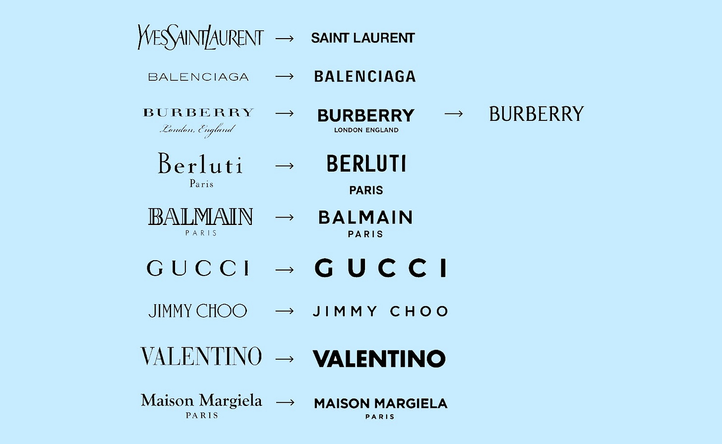
Anyone else think it’s significant that Burberry has switched back to a serif logo after a stint of sans serif? We’ve been deep in a capitalism-induced modern-design pit for a while now, where simplicity = value + universality = profit. Yes, it’s just a font, but it represents a pretty clear shift in attitude. As summarised in this iconic thread, minimal design has become stand-in for anonymity, modernism and consumerism, while traditional design, through its details, is able to carry a richer personality and taste. Could a renewed preference for traditional design signal something deeper about our desires?
In fact, everywhere we look, there are hints of an appetite for design that is able to reflect a desire for a more culturally rich world, one created with care and personality rather than flattened by cost-cutting and a loss of community. We can find the same level of detail in futuristic design, with all its glitchy intricacies. But ancient design, with its references to spirituality, the natural world, and a distinct lack of machines, feels like a more straightforward antithesis to the anonymous modern design we’ve come to disdain.
“I think we're looking to and learning about past traditions so we can tell stories of the present /future in richer ways - reject modernity and all that”, says MØRNING’s strategy lead Shadeh. But this isn’t the ‘reject modernity, embrace tradition’ of the alt right, instead, it’s a shift in visual preferences that reflects our desire to find meaning and romance in a depressing and nonsensical world. Ancient design helps us escape into historical fantasies, while enriching our current realities at the same time.
Exhibit A: The steady trend for medieval style references among designers, musicians and fashionistas. The Cut recently reported on the medieval headpieces that seem to be on every young starlet’s Instagram, Vogue recently reported on the alluring appeal of medieval shoes (pointy toes abound), following Vice’s and The Guardian’s reportage on the medieval-coded Enyacore of last year. Meanwhile brands and celebrities (Caroline Polacheck, we’re looking at you) continue to revel in the fantastical visual world of chainmail, candles, spears and cryptic symbols.
Exhibit B: Medieval TikTok has over half a million videos, mostly users cosplaying as their medieval equivalents in a kind of digi-Dungeons and Dragons, often drawing sharp similarities and stark differences between our present and past realities. While gamers and fantasy lovers have been revelling in history-coded play forever, the TikTokification of this medieval cosplay has no doubt blown its popularity (and social acceptability) wide open.
Exhibit C: Meanwhile artistic interest in ancient, medieval and pagan design is emerging via a slew of niche archive and art direction accounts like @__svyatoy__istochnik__ , @archaeologyart, @endlessspiral, @urpflanzine_, and @sacrificiumlaudis, all dedicated to exploring the intricacies of design of yore. Often hinting at ancient perspectives on the natural world, the sharing of these relics helps to inject meaning into the world we know today.
Exhibit D: The graphic design community has seen a parallel shift, with the brutalist graphic design aesthetic that’s dominated over recent years shifting from 20th century nostalgia to the more faraway romanticism of antique and ancient references (along with the revival of design aesthetics like emo and goth that draw on these visual cues). In places like Bristol and London, new gen music scenes that incorporate folk and pagan references are thriving, with these graphics helping to worldbuild around them.
Exhibit E: Same, but different, is the case of Burberry’s new logo: are brands going to find themselves swinging themselves back from modern fonts to heritage-coded ones? And, with that, will luxury become synonymous with the latter over the former? With the recent backlash over old money aesthetics as a way to re-popularise conservative Western culture, it’s not such a straightforward pivot. Pre-capitalist heritage aesthetics like medieval feel like an easy shortcut to achieving alt-traditional over trad-traditional.
Exhibit G: This yearning for something more detailed and classic is one we’re feeling at MØRNING, too. For our new trend report “The Age of Relevance” , “we wanted to bring some romanticism to our typically colder, darker and more brutalist art direction”, says Shadeh. The team worked on bringing more illustrative details to our work while not losing the digital perspective that is so intrinsic to MØRNING.
With our collective yearning for a more meaningful world, and individuality and creativity increasingly sought-after, these design aesthetics feel more valuable than ever: historical design’s capacity for details allows more room for creative expression, while also offering us all the fantasy of a Western world pre-capitalism.
By adopting these codes in our graphic design, style choices and media consumption, we’re breaking out of our 100-year nostalgia loop and into a time way back yonder, a time where the trend cycle didn’t exist, where we nature, community, and alternative beliefs about the world were abound. As we search for creative ways to cope with the modern world facing us, maybe we’re hoping to inject it with those same values.
Are you seeing medieval vibes everywhere? As always, let us know over on Instagram, or head to morning.fyi for our latest trend report download. Until next time!


I'm really into this style. I've wondered if the resurgence of medieval typography in graphic design over the past few years is partly due to the popularity of designers like David Rudnick, whose retro-futuristic work has sparked a sort of sub-cultural shift. The trend seems to have been happening alongside the current interest in British folk traditions, publications like Weird Walk, artists like Ben Edge etc.