White trash: the death of art direction
Grab your overpriced sunglasses as we face the blinding (and boring) void that stands where exciting luxury campaigns once stood.
It’s official: we’re deep in the sans-serification of fashion campaigns, as brands chase profit-friendly minimalism over personality (and sack off art directors in the process). Luckily for us, the iconic @dankartdirectormemes is here to take us through how the hell we got here, and what we can do to swing the pendulum back…
When does the “less is more” approach to luxury image making become indistinguishable from the most average e-commerce assets? Well, if you’ve scrolled through your social feeds of choice this morning, you’d be forgiven for thinking the answer is ‘right now’. An ever declining perception, and a perpetually declining understanding, of the role of the art director has led to a barrage of bright-to-off-white advertising campaigns and editorials, featuring the world's biggest actors, musicians and models - all stood hopelessly (and often lifelessly) within an infinite void of nothingness.
First, let’s look to Italy, where some of its most famous houses seem to have all but given in to this new way of selling the brand. Gucci, perhaps the shiniest jewel in Italo-luxury, has spent the last half-decade dazzling its audience (and competitors) with arguably the best visual direction in recent history. A house with a legacy for sexy, tantalising and jetset imagery under Tom Ford and his successor, Frida Giannini, seemed to reach its visual apex under Alessandro Michele, who spent seven years inviting people into a fantastically curated universe . To find that this approach has been so brutally rejected under his replacement, Sabato De Sarno, is no real surprise. Understandably, Gucci can’t be expected to maintain such a pace, nor budget, but the vibe shift is so dramatic you’d be forgiven for filing a claim for whiplash. Michele’s Los Angeles fever-dream is replaced by a stark, empty, emotionless depiction of ‘cool’.
Similarly, Versace, whilst no stranger to the big-empty-studio-shoot in it’s past, is a house that made it’s name synonymous with maximalism, with sex, confidence, optimism, six packs and leathery tans, it felt fun, risque and exciting. So when the brand went totally starkers in the least exciting way, one could be forgiven for thinking someone’s effort phoned in sick that week.
And then there’s Prada, which holds possibly the most beautiful archive of advertising campaigns of any luxury house, ever. Evocative campaigns through the 90’s and 00’s adorn most creative directors’ moodboards, today. Yet nowadays, you’re more likely to find the brand popping their logo atop an infinite void of white that illuminates a runway look, yet has the gall (and wordy press release) to call itself a campaign like the ones before it…
The same goes for fashion mags. Nowadays those pesky budget restrictions run in a weird ugly dance with necessary commitments to advertising. We get 12-18 page stories where honestly, fuck all happens. But it’s ok, it’s clean, it’s fresh, it’s okay because it’s pure f a s h i o n you’re looking at. The brands will be happy, the credits are all there, the job is done. But it’s this idea of a ‘purified’ image that suggests we are removing the noise to get to the facts, to no longer obfuscate what is being offered, but what it’s become is now a ‘buy me, buy me, buy me’ organisation of assets.
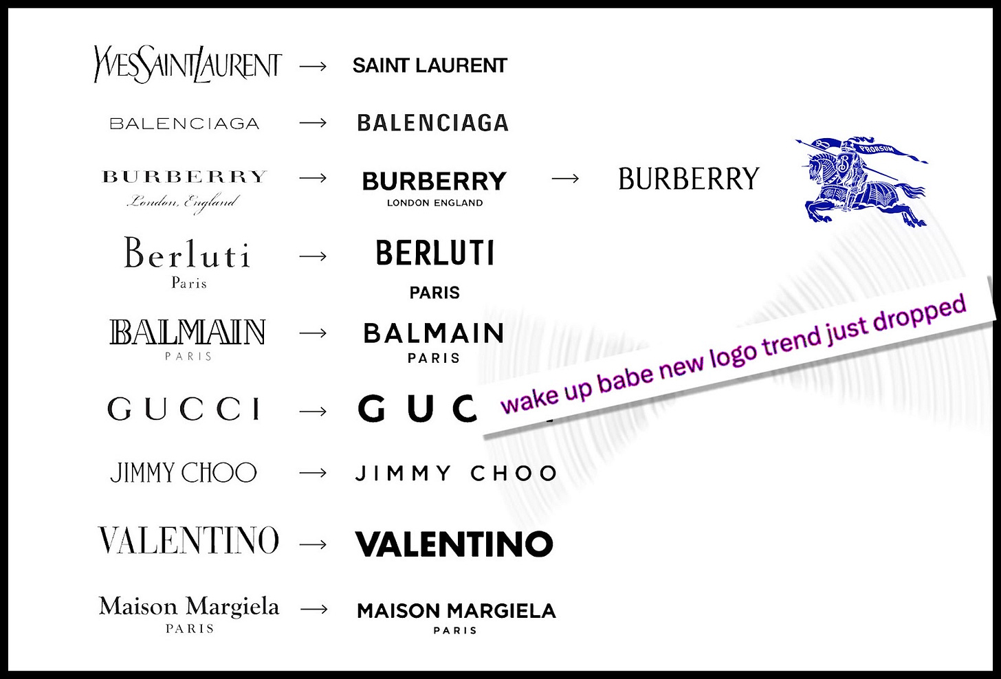
We’ve come to witness the sans-serif-ication of picture making. Following the way luxury brands all rushed to shed their logos of identity in search of a more ‘modern’ mark in the mid-2010s, our industry of image approvers have done the very same - they’ve helvetica’d it.
We’ve only just started to see logos and rebrands slowly pivot back to personality and to unique-ness, but how quickly can images come back to do the same? To understand that, we have to understand how the hell we got here in the first place.

The big question: why?!
In this age of commodity, this specific all-white-background aesthetic makes sense: the clothes are what’s being sold, and so they should be the focus.
Why wouldn’t you remove all the distractions? Meanwhile, the lion’s share of creative budgets have now been transferred to ‘talent’ (a terrible descriptor which reduces everyone else on the job to service people) as a way to maximise reach (and, supposedly, sales). This leaves the rest of the team to be negotiated downwards in order to create something premium for a pittance, without consideration to any available artistic ingenuity, imagination or integrity in what’s being created. Images and videos are merely ‘assets’ for sharing, it’s not worth making ‘art’, because it’s ‘content’ – and creating something that travels is more important than creating something that lasts.
What’s left is an oversaturated market for camera-wielding creatives who confidently achieve very mid image making, but there are far, far less who can push beyond that and deliver something premium, something that surprises the client (or even the customer), and which is just undeniably special.
In this age of commodity, this specific all-white-background aesthetic makes sense: the clothes are what’s being sold, and so they should be the focus.
Meanwhile Art Directors have suffered something of a rejection, as Creative Directors have gained more power (see 2018’s flurry of CDs which included everyone from Virgil Abloh to Molly Mae) and swallowed the AD role in the process. What’s formed is a noticeably widening chasm where many an Art Director has been reduced to the role of artworker. Valuable in its own right, but a noticeable demotion in duty and creativity, ADs are now responsible for breakneck-speed deck compiling, retouch comments, logo and branding placements, but all on top of an image that hasn’t had the best of their skillset, insight and expertise. In this new, commodity-driven industry, AD’s once reference-flooded decks, rich with book scans, film grabs and pose references become almost pointless.
The strangling of creativity from every place it once flowed freely is pushing brands into thinking they are the creative ones. And not to be all gatekeepy, but that really isn’t their job…
The death of art
Brands often look inwards at times of indecision (which, with slashed budgets and less investment in talent, there’s plenty), choosing to pinpoint moments of success and strength in a vain hope to recreate it for a new audience. Recreating simplistic studio shoots by Penn, Miesel and (most commonly) Avedon seems certainly like a nice idea in the weeks running up to a shoot. But as the weeks fly by, and options of talent and team rotate and drop out, it all becomes a little bit sadder and more watered down. It’s a bit like painting a wall blue and telling yourself it’s giving Yves Klein, or tossing some paint at a canvas and calling it Pollock - it’s cute but it’s not an artwork.
The customer also loses out, really, because they are being exploited as a wallet (or purse) like never before. Not so long ago, that same fashion customer might’ve torn out a double-page advertisement and stuck it on a bedroom wall or scrapbook, perhaps even have been comfortable in considering this commercial practice as real creativity, filled with nuance, storytelling and effort. But now, they’re being fed flavourless content that’s out to make a quick buck, and shunt you right on over to its next paid partnership.
Well, who’s going to change it?
The hundred-thousand Euro question. The creator's hands could do the brands a solid and push them further, creatively, but that seems risky for what little return is currently on offer. Pressing for more, you can (apparently) come across as hard work, complicated, too much, and it can scare some of these busy executives to consider new ‘big ideas’ on top of their other scheduled demands. Don’t get me wrong, not every campaign #concept is palatable, or even good. Just as much as not every plain-ass studio shoot is a lifeless flop, but the current balance is just far too out of whack right now.
No, what I feel is needed, is found somewhere along the C-suite; inside these brands (and their holding groups) the executives need to engender a bit of healthy competition in order to realise that they might want to do better than their neighbour, and not just mimic them. Burberry, as a recent example, scared the bejesus out of a few rivals as they performed a creative handbrake-turn into their uber-orante horse icon and *gasp* a blue serif logo. These changes take some time, and a lot of money, so in the meantime, perhaps a photo-based pissing contest might do our jaded creatives some good…
Until then, I’ll just sit here, ignoring each new bleach-white campaign that pisses away my phone battery with its excessive use of LED, and lament how we used to be a creative industry, and of late we are becoming far more a creative service, but with the ‘creative’ written in pencil, or worse: invisible ink.
Depressingly,


I feel like part of the problem is the world we live in hardly has any reason for us to dress in this wild, extravagant way. All we do is work, maybe work out, catch a casual social gathering but we hardly have a reason to wear something more than casual.
I hope the fashion industry shifts away from this because it hardly feels inspirational, dreamlike anymore!
You know there’s an issue when luxury fashion ads look like Gap.